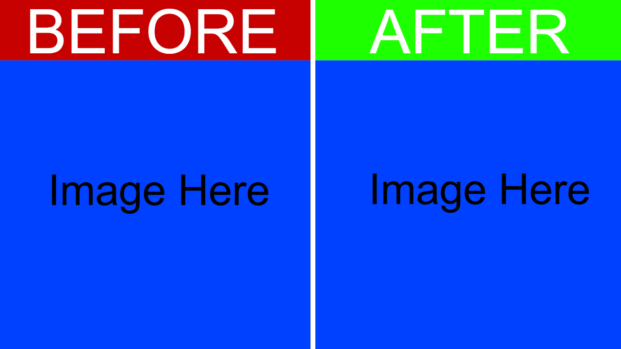
Before vs. after thumbnails are a good way to show change. Many people use them, but many also use them wrong. This article will teach you how to properly make a BVA (before vs. after) thumbnail and some tips to help it perform.
The layout of this format is pretty simple. Create 2 bars and put them at the top of the screen. Make the bar on the left a darker red color. Make the bar on the right a brighter green color. Then, add text to the left bar that says "Before" and add text to the right bar that says "After." After that, add a separator (either a white separator or whatever the background color is) between the "before" and "after" sides. Finally, add your before picture on the before side and the after picture on the after side. Bonus tip: if you want, you could add a "vs." text in between the before and after sides.
Some common mistakes that people make when creating these kinds of thumbnails include using too much text, using hard-to-read text, accidentally making the subject of their image blend in with their background, putting the "before" side on the right, and making the layout too messy. To fix these, make sure your text looks good and is easy to read; make sure to adjust the background color if needed, keep the "before" side on the left, and don’t overcomplicate the layout. And of course, as with all thumbnails, make sure your images are of high quality.
To create a BVA (Before vs. After) thumbnail, create a left “Before” side that is darker red, then create a “After” right side that is bright green. Add a divider between these two sides, then add your images. Avoid common mistakes such as small, unreadable text. If you don’t want to go through this process every time from scratch, then you're in luck. Our thumbnail editor is soon coming with templates, so all you need to do is select the “Before vs. After” template or any other, add your images, then save the thumbnail.